Power BI Career Starter Lab
Build an airline operations dashboard from four connected Excel files. This is a separate analytics practice section: it complements API Camp’s coding tracks without changing them.
Get the practice files
Download all four files into one folder. They use synthetic airline data and are designed to be related in Power BI.
Lesson 1 · 10 minutes
Import the data
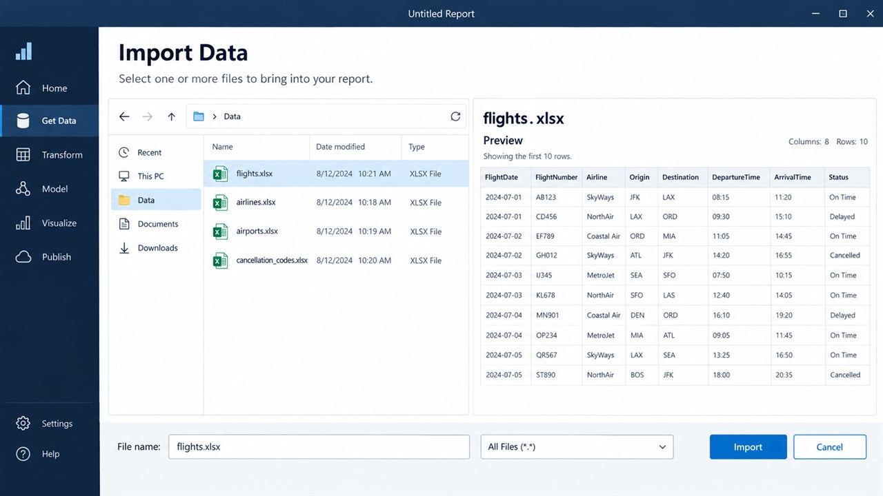
Lesson 2 · 12 minutes
Connect the data model
Open Model view. Drag fields to create these relationships:
Flights[Airline Code] → Airlines[Airline Code]
Flights[Cancellation Code] → Cancellation Codes[Cancellation Code]
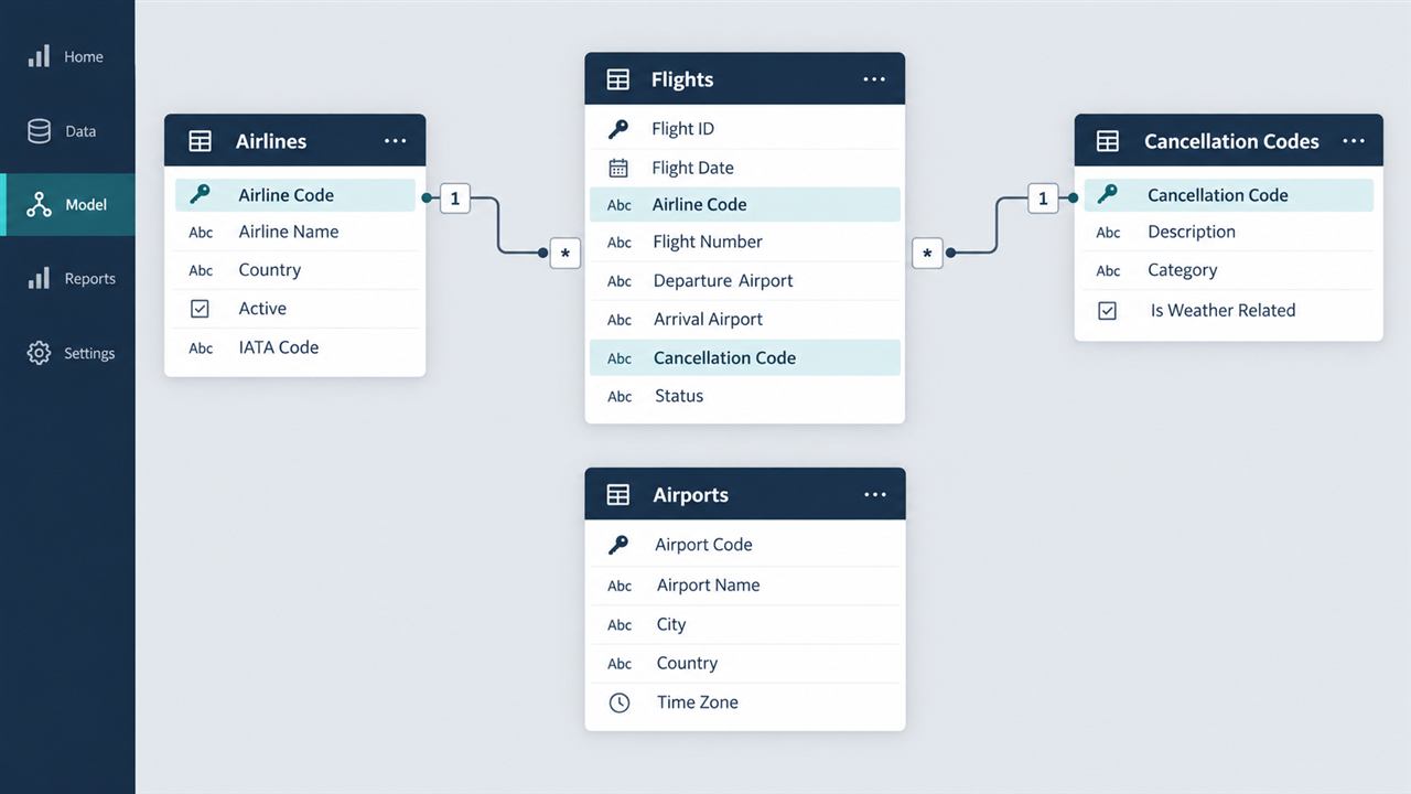
For airports, start with Flights[Origin] → Airports[Airport Code]. Airports have two possible roles (origin and destination), so keep the first version simple.
Lesson 3 · 15 minutes
Create your first DAX measures
Right-click the Flights table and choose New measure. Add these one at a time.
Total Revenue = SUM(Flights[Total Revenue USD])

Total Passengers = SUM(Flights[Passengers])

Average Arrival Delay = AVERAGE(Flights[Arrival Delay Min])

Cancellation Rate = DIVIDE(
    CALCULATE(COUNTROWS(Flights), Flights[Cancelled] = "Yes"),
    COUNTROWS(Flights)
)

Profit Margin = DIVIDE(SUM(Flights[Profit USD]), [Total Revenue])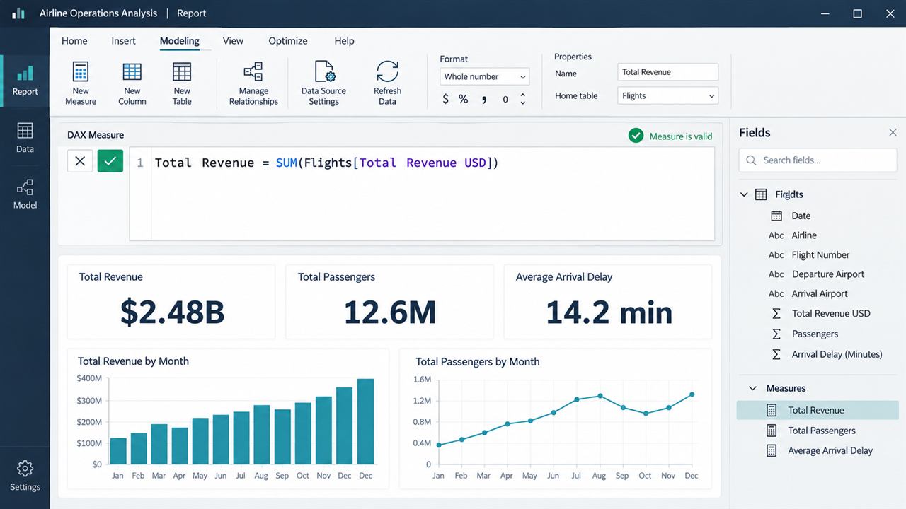
Format revenue as currency, delay as a whole number, and the two rates as percentages.
Lesson 4 · 15 minutes
Build a dashboard
Start with questions, not decoration. Add these visuals in Report view:
Total Revenue, Total Passengers, Average Arrival Delay, Cancellation Rate
Bar chart: Airline Name by Total Revenue
Bar chart: Route by Average Arrival Delay
Column chart: Cancellation Category by Cancellation Rate
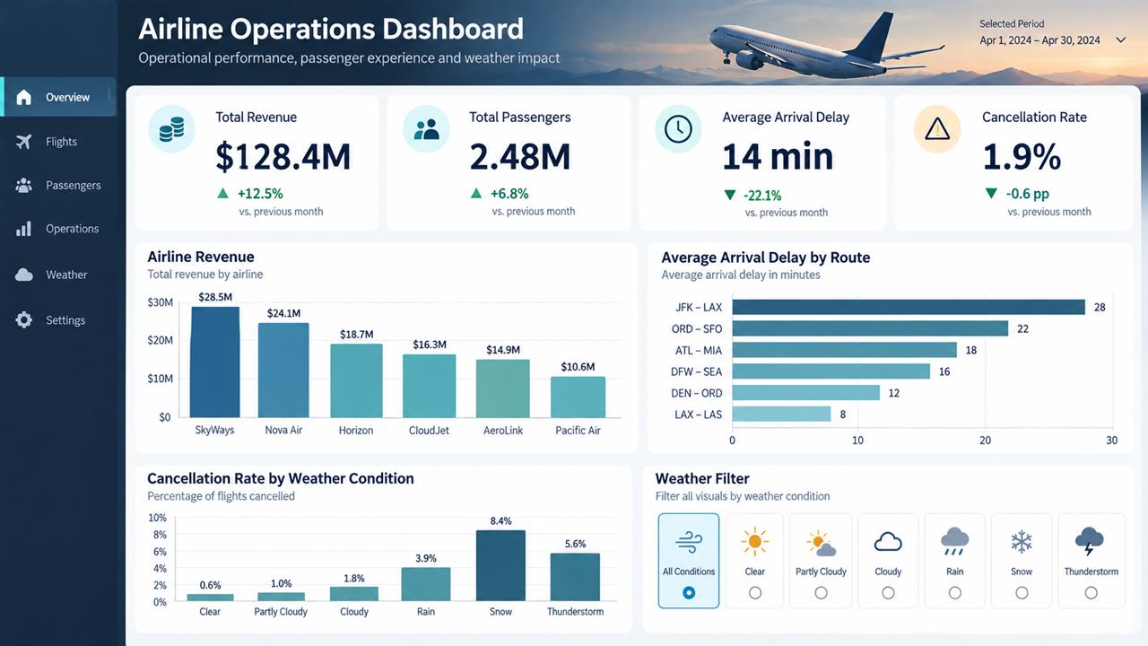
Add a slicer for Weather Condition. Click a weather type and notice how the entire report responds.
Lesson 5 · 8 minutes
Practice the analyst story
Use your dashboard to answer each question. Then reveal the coaching note.
Which airline has the most revenue—and is it also the most profitable?
Which routes have the biggest delay problem?
Does weather appear connected to cancellation rates?
Next skill for Power BI jobs
Add a Calendar table, learn Power Query data cleaning, and practice SQL alongside Power BI. Create two more projects in different industries and keep a short written explanation for each one.